
Project: Creating a logo for the flower company FIORI,
which specializes in flower delivery by subscription.
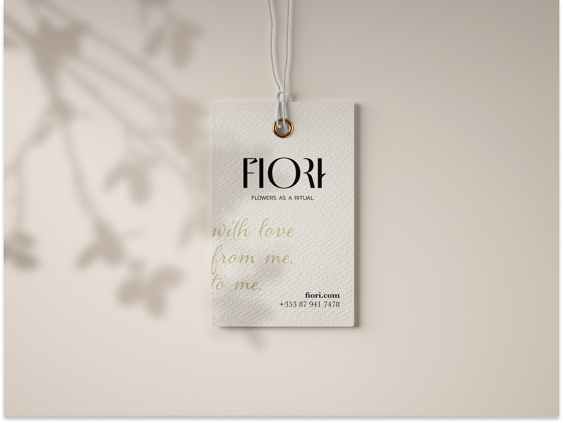
The design of the FIORI logo is simple and straightforward, making it easy for customers to recognise and remember the brand. This is important for a company operating in the flower delivery industry, where competition is very high.
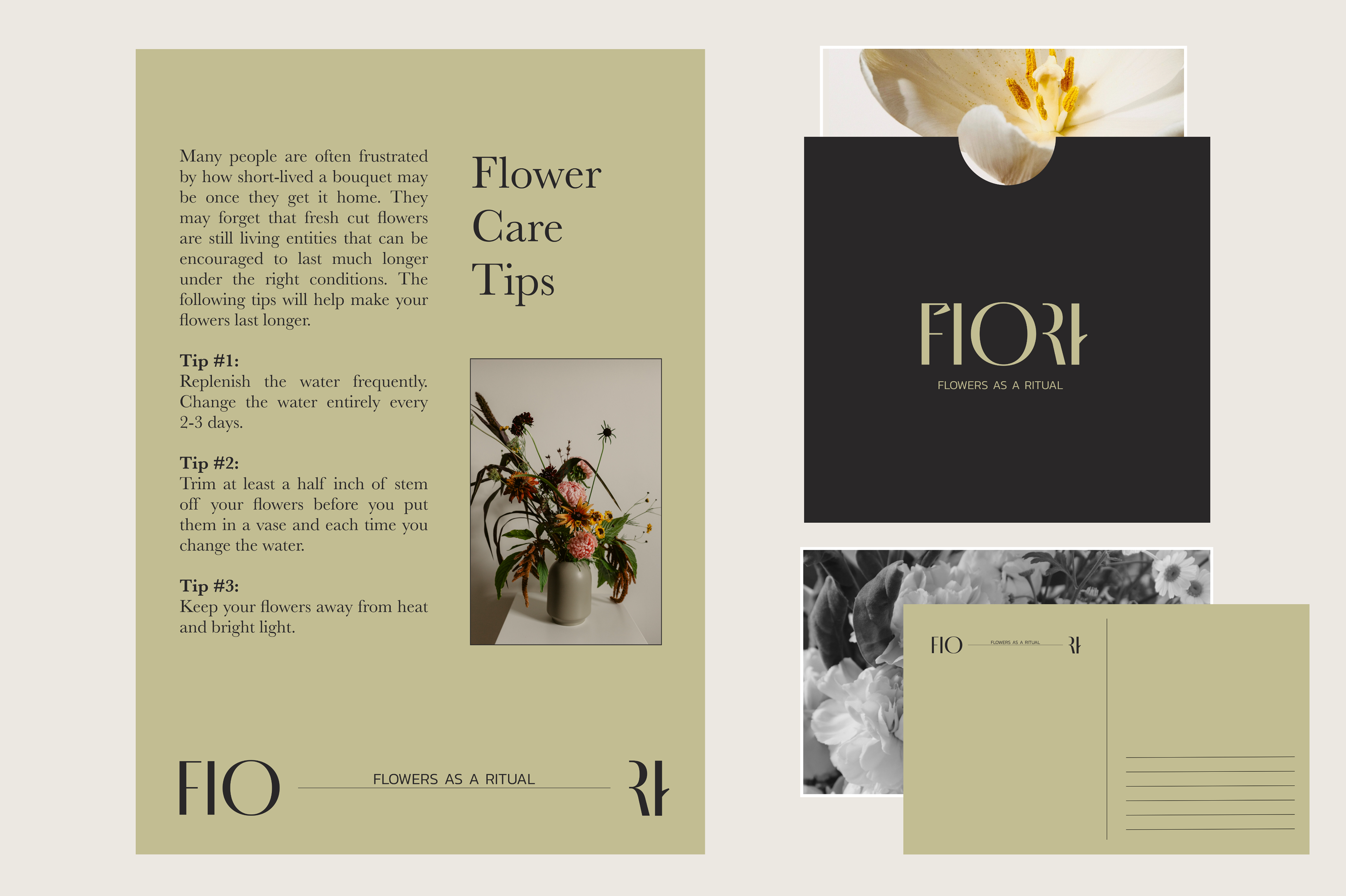
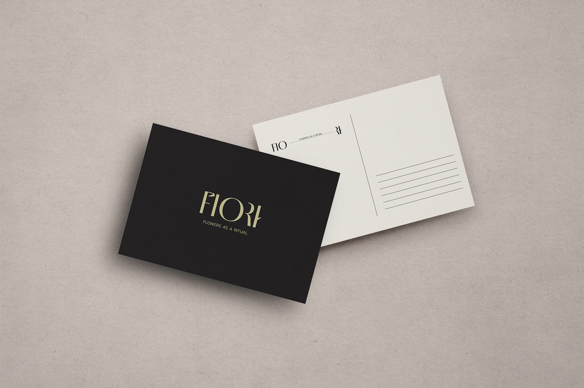
The color scheme of the logo consists of black and beige colours.
The black colour symbolises eternity, solemnity, and sophistication, which helps to emphasise the seriousness and professionalism of the FIORI company. Black also symbolizes elegance and luxury, which are important for a company specializing in flower delivery.
The beige colour complements black, creating a gentle and cozy atmosphere that emphasizes the company’s friendliness and care for its clients.




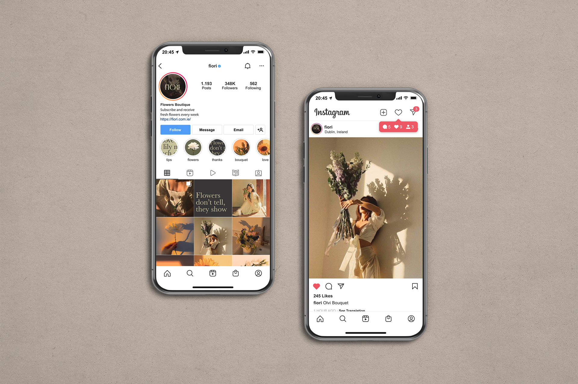
Instagram is currently the key marketing channel and the logo in circular shape works well in that context.
For commissions and enquiries, or just to chat about any projects you may have in mind, contact me here: